This discussion will be on the controls shown below. For quick links to more information on these, click on  the relevant control in the image.
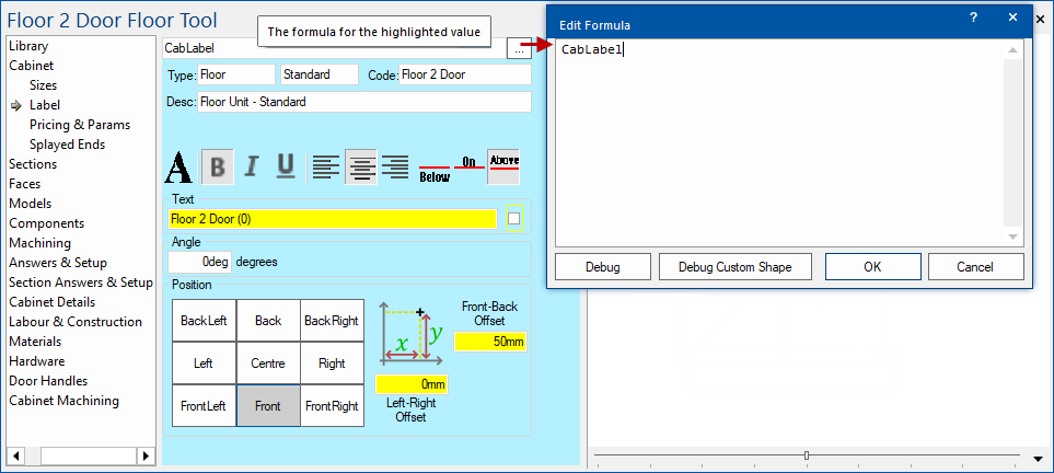
Formula
Formula edit boxes are an especially important control, particularly when designing flexible and powerful cabinets. It appears every time you click on a property which can be formula-controlled, such as an edit box, checkbox, radio button or list box. After clicking on one of these, you can type an expression into the formula edit box to make that value controlled by the result of the formula.
A formula-driven control is usually indicated by a yellow background, or red if the formula has some kind of error. See the Formula Reference for more information on using formulas. You can use the 'Debug Window' to evaluate and display formula values. See also Machining > Machine Step.
Example : Formula driven controls and debug window
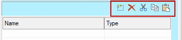
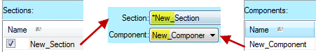
Section List
The Section drop down lists all the names of the sections in this cabinet. To edit a section, select its name from the list box. The details on the page will reflect those of the new current section and its name will be displayed in the box.
The section list has an extra feature over an ordinary list box, because it indicates "relevant" sections. Sometimes you will notice that several sections at the top of the list start with an asterisk ( * ), and that is because they have some special meaning on the current property page.
For example, on the Components page, sections which actually contain components are marked as relevant. This makes it much easier to see at a glance which sections are worth looking at regarding components. On the Section Imports page, those sections which actually contain imported sections are considered relevant so are also placed at the top of the section list.
Go To Parent
This Up folder icon is only active (appears) when the currently selected section is a child section (i.e. it has a container), and it appears as a folder with an up arrow.
 Clicking it changes to the parent of the current section, moving one level up the section hierarchy. The reason for the folder icon is that this is very similar to moving to a parent directory in a file browsing application. See FAQ Missing Sections. For top level sections, it is greyed
  out.
out.
Clear Import Spec
This key  icon is only active when the current section has been imported. Importing a section is like linking to another cabinet and including it as a section in your cabinet. The linked cabinet can even be in a different cabinet library to the current one. The reason for this is that lots of cabinets have common features, so it is much easier to maintain one imported copy than making some change to each cabinet.
The Clear Import Spec button clears the "import specs" of the containing section and places a separate copy of the section there instead. (This is like the difference between linking to an object and embedding it). The new section is now independent from the original imported section and can therefore be edited i.e. allows you to modify an imported section and allows access to its controls (which were previously greyed out).
Warning message
A warning message will be presented when you click this key icon, asking you to confirm that you want to continue. If 'Yes' then it imports and embeds a copy instead of always linking to and refreshing from the sub-library it came from. This then lets you edit the section locally, making it different from the library version.
Be aware that this will not get updated with any future library changes (including fixes or extensions).
Present Flag

This check box determines whether the current section is present, i.e. whether it exists or not. Unticking the Present flag completely hides a section and any sections inside it from plan and 3D views. It also no longer appears on reports or is counted in cabinet pricing. This can come in handy for a number of situations, for example a section could have two styles of construction which is too complex to handle with formulas. You could make the two different versions separately and only make one of them Present at one time. This situation could perhaps also be handled by Section Imports.
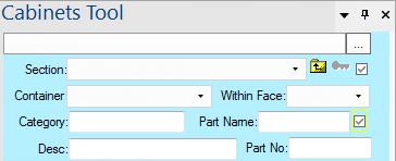
Container
The Container list displays or sets the name of the section which contains the current one. This is also known as the parent section because of the tree structure of sections. A section can only have one Face page section, and it starts off with the same dimensions as its container. If a section's container is set to "<none>" then it is a top-level section and starts off the same size as the Nominal dimensions of the cabinet.
Within Face
When a section is contained within another, it usually fills the whole of its container initially and faces the same direction. However, in some cases we want the section to be attached to one side of its parent, e.g. an end panel of a cabinet. In this situation we can place the end panel within one of its parents faces instead of within the body of the section. See also Sections Within Faces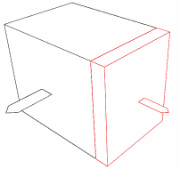 Placing a section inside a face has the effect of:
- Changing the orientation of the section. When a section is placed in a left face, it no longer faces the front of the cabinet, but to the left. In other words it always faces outwards from the cabinet. This means the depth of the cabinet now becomes the width of the face which is much more intuitive than having an end panel which is say 16mm "wide" and 600mm "deep". Instead the panel faces outwards to the left so it becomes 16mm thick and 600mm wide.
The image to the right shows a large section in black with the black arrow indicating its front face. Contained within the right face is another section drawn in red, with a red arrow indicating its front face. Notice that the orientation of the contained section has changed to point outwards from the centre. - If the parent section is Panelled, the section takes on the thickness of the panel it is in. Using the end panel example again, we could tick the Panelled box of the parent and give its left and right face panels a thickness of 16mm. Now when we place sections inside the left and right faces, they start out with a depth of 16mm.
 When a section is placed in the Top or Bottom face of a section, its orientation does not change to point up or down. Its width is still across the cabinet and its depth is still between the front and back of the cabinet.
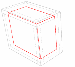
The other two unusual "faces" are Outside and Inside. Outside is the default and means to take on the size of the whole parent section, not just a particular face. The Inside face is similar except if the parent section is panelled, the section will fit inside all the panelled faces. It will effectively be recessed by the thickness of all the faces of its container.
The illustration to the left shows a panelled section in light grey which has a thickness on all of its faces. Contained within its Inside face is the red section, which has assumed the interior dimensions of its container. Note that no recesses had to be manually applied to the red section, all we did was place it in the Inside face.
To formula-control the Within Face list, you can either give the name of the face (e.g. "FrontLeft", "TOP", or "inside") or its index. The indexes of each face are:
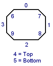
- Inside
- Outside
- Back
- Right
- Front
- Left
- Top
- Bottom
- BackLeft
- BackRight
- FrontRight
- FrontLeft
Category, Part Name, Part Number and Description
These fields can be used to hold any additional information required for reporting. They are typically used with the Import Description flag which fills them out with information about an imported cabinet. This is handy if the code of a cabinet holds important information, because it is otherwise lost when it gets imported.
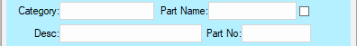
There are two controls – the actual partname (a string) and a checkbox saying whether to enable this partname. The Part Name field provides a name for the section for inclusion in the breadcrumb when breaking a cabinet down into parts. The check box allows disabling the section from being in the part list without having to use formulas to empty the name itself - both the name and the checkbox are independently formula-controlled.
Where these part names are defined at multiple levels in the section hierarchy, the breadcrumb will likewise have additional levels, so that machining-level parts can be grouped together into a common assembly. For example, the breadcrumb might include a level for selecting between drawers 1,2&3 and then a lower level where you can select between the drawer bottom, drawer sides etc to edit machining.
See discussions on Friendly Part List and Sections > Import page which discusses the breadcrumb selection.

 These controls allow you to place a text label anywhere on the face of a section, such that it stays in the correct place when the section is resized too. A label is based on a single point called the attachment point which can be moved around the face. The text can also be moved relative to the attachment point using the Label
 In the middleware there is even the concept of othersection so if my section name is "shelf1" and you happen to be in "Main", then "othersection" refers to "Extn" "shelf1" which is useful for matching up machining etc. See also