
A slider bar can be either vertical or horizontal as shown.
We also have lots of control over detailed setup.
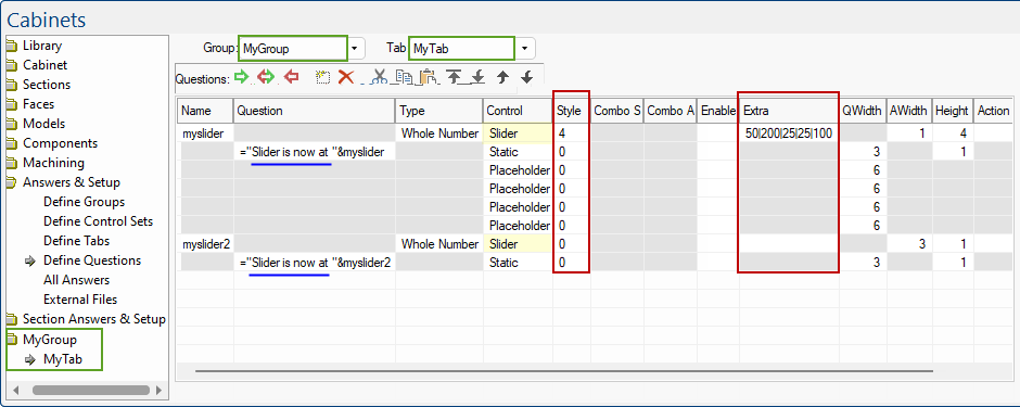
We use the "Extra" field to control the setup of the slider.
This is a pipe separated list specified as follows min|max|tick-interval|interval-keyupdown|interval-pageupdown.

For example, if you wanted a slider to go up by 5 units, starting from 0 to 100, with ticks defined every 10 units, you would set the extras field to 0|100|10|5|5. The resulting slider is shown:
You can see that the ticks are at every 10 units, but the user is able to go up or down in increments of 5.
The Style field is a whole number that determines the style of the control being displayed.
Sliders can be vertical or horizontal.
We can also control the style of the slider by using the following options. For example, add 1 (TBS_AUTOTICKS) if you want ticks for each interval along the slider.
| Style Number | Comment | ||
| 1 | TBS_AUTOTICKS | Autoticks | The slider has a tick mark for each increment in its range of values |
| 8 | TBS_BOTH | Ticks both sides | Displays tick marks on both sides of the control. This will be top and bottom for a horizontal control and left and right for a vertical slider. |
| 4 | TBS_TOP=TBS_LEFT | Ticks above/left | Displays ticks above a horizontal slider or to the left of a vertical slider. |
| 0 | TBS_BOTTOM=TBS_RIGHT | Ticks below/right | Displays ticks below a horizontal slider or the right of a vertical slider. |

In the following image "Slider is now at..." is just a static text control that happens to have a formula using the cabinet answer for the slider nearby.
Slider controls in Friendly Pages can be set up to control lots of things, but sometimes we want a slider to control the folding up of an item.
If the user is watching the item in a 3D view while it is folding, it is helpful to have good performance so the folding happens more smoothly. To achieve this, you can add a special action to the slider control's action field like this...
_systemaction("UpdateFolding")
When you do this, the slider picks up the presence of this system action and the updating of the variable enters a "stealth mode". Changing the variable then does not update the whole item - it is assumed that you are using the controlled variable directly in the 3D Transform folding controls for some sections of the item, and only the folding specifications are recalculated - nothing else. The item should still fully update when you stop moving the slider however. When there is no user activity, the system enters an idle loop and cleans up calculations that may be needed to restore consistency.
Now things get more complicated if you are doing some intermediate calculations on the way to setting the 3D Transform angles. In that case, you have to be careful to also forcibly update any intermediate variables using a SetValue or SetFormula action.
To illustrate... [This example is from the "POS Countertop C-FL-300"]
Suppose we have a variable Xdeg which is set to some value based on the position of the slider, then used in a number of places to set the maximum fold angle...
The slider itself and an edit box next to it both control the same variable, Xfoldsliderval, like this: 
Here is what the two controls look like in the friendly page:
Notice that the slider has this "stealth updating" property, because it has the _systemaction("UpdateFolding") action. This means that as you move the slider, it will update Xfoldsliderval and recalculate the folding for the item but nothing else.
In this case, the folding of one of the sections makes use of a variable called Xdeg, like this...
So the problem is that if Xdeg is simply given a formula based on Xfoldsliderval, the position of the slider, then Xdeg will not update as the slider changes position.
To make it update, we need to explicitly add another action to the slider. For this, we have defined XdegAct using this deferred formula...
XdegAct String :SetValue("Xdef",if Between(Xfoldsliderval,50,65,0) then 90deg else 0deg)
This action sets Xdeg to either 90deg or 0deg, and clears any existing formula:
When it is 90deg, the actual folding is actually Factor times this, so can be smoothly increased from 0 to 90 by controlling "Factor".
We then added a second action XdegAct into the action formula for the slider control, which now looks like this (the semicolon is a separator between the two actions)...
_systemaction("UpdateFolding");XdegAct
Now when the slider is moved, the system action still forces a recalculation of just the folding transforms, but the second action XdegAct forcibly updates the value of the variable Xdeg. The updated Xdeg is then used in the next paint of the folded item.
There is a second control (the edit box) that the user can type into alternatively to directly set the folding %.
This also changes the variable Xfoldsliderval, which repositions the slider but does not fire the slider action. So we also need to add XdegAct to the action formula for the edit box.
Of course, changing the edit box does update the whole item, not just the folding, but since Xdeg does not have a formula in this setup, Xdeg still needs to be explicitly updated.
Sidebars use the “control sets” to allow easy sharing of common sidebar friendly page definitions. They also default to a drawing level controlset for both item and part sidebar definitions, and there is a “view” sidebar that applies when no item or part is selected.
The sidebar can be docked or floating (or turned off completely) and can be resized, but defaults to a narrow size docked on the right.
The size of the sidebar does not change as the selection changes (unlike the normal propery inspector which remembers its size independently for different types).

Simple properties sidebar, narrow, no tree control, no right-side-pane, uses "simple" page, on/off via ribbon button (like cabinet picker).
Default sidebar controlset for items and parts with no sidebar page defined - check at drawing level for default controlset to use.