CabMasterPro User Guide
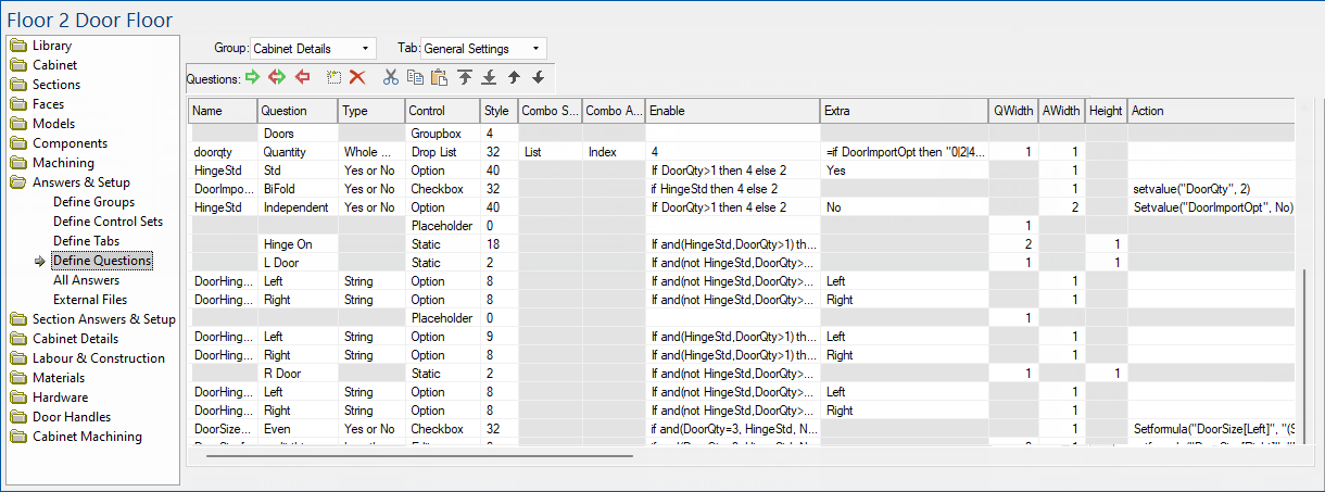
This section will expand on the details of each column (or field) in the Define Questions list.
To locate information about any options on the following image,  click on the area of interest.
The columns are used for different purposes depending on the type of control.
You will notice that certain fields in the list become greyed out as you change values, this is because those particular fields are not applicable at that time. An example is when you set the 'Control' to something other than a list, the 'Combo Source' field becomes disabled because it is no longer relevant. When you select a list from the 'Control' field, the 'Combo Source' field becomes active again.
This is the name of the property from the All Answers page to place the result from this question into. For example, if we wanted to control a property called "benchtop_thickness" using an edit box, we would create a question with "benchtop_thickness" in the Name field.
Some types of question cannot have or don't need a value in the Name field, such as a static text label. In this case the field will either be disabled or you can just leave it blank.
The value of the Question field is the text prompt associated with a question. It lets the user know what the control is used for, and every type of control should have the Question field filled out. It should be in plain English, such as "What is the thickness of the benchtop?" or more concisely, "Benchtop thickness:".
For most control types, such as an edit box, lists, and checkboxes, the Question text is typed next to the control. With buttons and group boxes, the Question text appears on the control itself. The Question field of a question can be formula-controlled, just put an equals sign or colon in front of the formula so that it is not interpreted literally – instead, this formula will be evaluated.
This allows you to set which type of answer the question will accept, such as a text string, a length, a time, etc. The available types are listed on the Data Types page. When you are using the question to control a property, you should set the question to be the same data type that the property is.
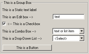
This field determines how the question will appear on the Friendly Page, and allows you to select which Windows control to use. Certain controls are better for some kinds of question, e.g. a checkbox is best for a question requiring a Yes/No answer.
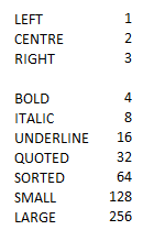
This is a whole number that determines the style of the control being displayed and have different purposes depending on the type of control.
The following style numbers are for all the font alignment and font styles for text in edit boxes.
To set a style, add the above numbers for example...
- If you want left justified, bold and underlined then style is 1+4+16 = 21
- If you want centre justified and quoted then use 2+32 = 34
Bitmap/picture fields use a different meaning for the style column, essentially yes or no where...
Example: Setting style to 1 means KEEPASPECT for an image.
For Style numbers used specifically for sliders, see topic on Sliders and UpdateFolding.
The Combo Source field is used with list controls to specify where the contents of the list are drawn from.
It is only active when you set the Control field to either "drop down" or "drop list".
Like 'Combo Source', this field is only active when the 'Control' field is set to either of the two list types. It allows you to specify how the answer will be read from the list, either as the text visible in the list control, or the index of the selection.
The index of the selection is where it appears in the list box, starting with an index of 1. This means if the user selects the third item in the list, the number 3 will be returned. An index of zero indicates that no selection has been made yet, or that the user has typed in their own value in the case of a combo box.
The 'Enable' field determines whether a control is visible on a Friendly Page or not and whether it is active or not. It is used to disable or hide controls which are not currently relevant, and is usually formula-controlled.
Enable modes 0 to 4 are supported. For ease of use, Yes or No is also supported (Yes is same as 3 and No is same as 0). Also, if nothing is entered in the Enable field, it defaults to Yes and shows the question.
An exception to this is when there is a formula behind the variable being displayed in a control. In this case, the control will be disabled even if you set enable to Yes, because changing the value would make it inconsistent with its own formula. Enable mode 4 overrides this behaviour, and if the user changes the value, any formula behind the controlling variable is deleted. Typically, you would use SetFormula actions behind a button elsewhere on the page to allow the user to restore these formulas when using mode 4.
The Enable field should contain a formula which evaluates to a whole number or Yes/No, or just the literal mode.
Possible modes for the Enable field are:
| Mode | Description |
|---|---|
| 0 or "No" | The control is hidden and collapsed. Other controls below move up the page to fill up the space |
| 1 | The control is hidden but does not collapse. A blank space is left where the control normally appears, which means when the control is re-enabled, the other controls on the form don't have to re-position themselves. |
| 2 | The control is disabled (greyed out) but still visible. This method is usually preferable as it lets the user see that the controls are available, but are activated by another option |
| 3 or "Yes" or empty | The control is visible and enabled. This is the default state, and lets you actually use the control. |
| 4 | A control which is active will be disabled if there is a formula behind its controlling variable. This enables the control regardless, so you can still enter new values. If a new value is entered, the controlling formula will be deleted. |
This field contains any additional information required for a drop list.
Depending on the Combo Source selected, the Extra field will contain either a list of options, or a folder path.
A list of options is provided as a "pipe-separated string". This means all the possible values in the list are joined into one string with pipe characters "|" in between them. So to have a list box containing several colours for example, we would type in "Red|Green|Blue|Black"
Sliders use a string with pipe characters e.g. 0|100|10|5|5.
See topic on Sliders and UpdateFolding for more notes on Extra, used specifically for sliders.
The terms QWidth and AWidth mean "question width" and "answer width" respectively.
Each Friendly Page is divided up into six invisible columns, and our controls can fill up as many columns as needed up to the full six. The "question" part is the text prompt for edit and list boxes, and the "answer" is the actual edit or list box. It depends on which type of control a question is, but which part is "question" and which part is "answer" should be made clear depending on which of these fields are enabled.
The default QWidth and AWidth are both 3, which means they will both take up half the width of the page. If both are narrow enough (i.e. set to 1 or 2), following questions may be placed on the same line if they are also narrow enough. This means you can fit more than one control per row on a Friendly Page.
The extra Height column specifies the height of this control as a number of rows. For controls with a height of more than one row, the friendly page editor tries to reserve space below the first row to avoid controls overlapping, as it is possible to define a control on the following lines that would overlap by accident otherwise.
Normally, each control in a friendly page is just the height needed for one row. You can however increase the height of a control – just specify the number of rows high, e.g. say 3 if you want the control to be 3 rows high.
This field is used for running formulas when a control is changed. The obvious example is executing a function when a button control is clicked, but any editable control can have an Action, not just buttons. The function in the Action field is run (or "fired") when the value of a control is changed, i.e. when a checkbox is clicked, when a value is selected from a drop-down list, or when a text box is edited.
Any function can be included in an Action formula, but the most common types are those referred to as Action Only. An Action field is the only place you can use these types of formula, because they perform actions with real effects, such as displaying a message box or editing a file on disk.
The following is an example of how the above fields can be used.