
A sidebar is a simple friendly page that you can associate with a cabinet in the library so that it appears as a sidebar when the cabinet is selected.
The sidebar is enabled or disabled by a ribbon command button, shown below RHS, and works like this…
Usually it contains some of the most commonly edited properties of the cabinet, allowing quick updating of those. These properties are generally also in the full friendly pages for the cabinet.
Using Control Sets lets you create dynamic sidebars in middleware. Define a Control Set and then reference it via a variable at item, page, drawing or library level. So you can define sidebar friendly page groups for all items in a library and override as necessary for certain items.
Sidebars also default to a drawing level control set for both item and part sidebar definitions, and there is a “view” sidebar that applies when no item or part is selected. The sidebar can be docked or floating (or turned off completely) and can be resized, but defaults to a narrow size docked on the right. Its size does not change as the selection changes (unlike the normal property inspector which remembers its size independently for different types).
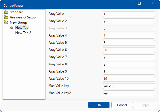
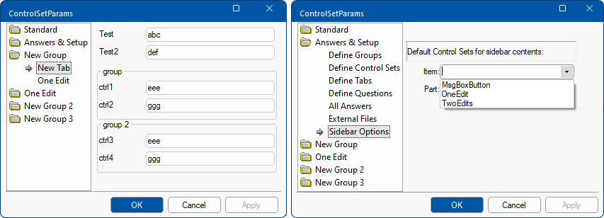
Download these linked samples which show the use of control arrays and parameterised control sets.


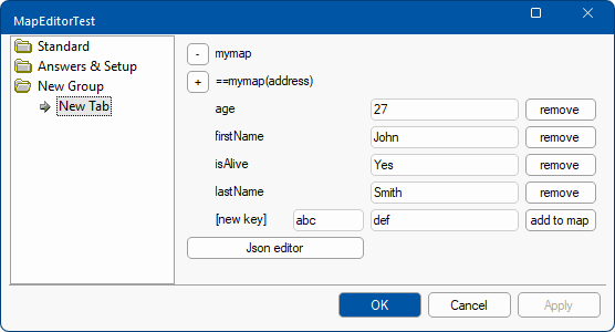
Here is a more complex sample which creates a little map editor built into the drawing properties using recursively defined control sets:
