
Available from the File menu > Options or use Keyboard Shortcut F10.
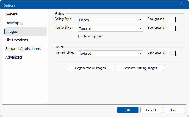
The Images page options provide the ability to control how the gallery on the Home tab and the Cabinet Picker images are displayed.
 |
For quick links to more information, click on  the options or another category/page.
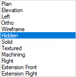
The style of the images on the Gallery and the Cabinet Picker can be customised by using the drop down menu.

The Style that is displayed in the Cabinet Gallery is provided on the Home tab , can be specified with or without captions.

The Style and background colour of the Tooltip can be changed independently.
The Tooltip shown is accessed by hovering over the relevant Gallery image.

Change the color of the background by using the Colour Select button. In the example Tooltip shown above, the background is green.
The distribution base library (.qil) provides all with a preload of some useful palettes. However, you can save your favourite palettes for quick use in the cabinet gallery, and customise using a tree. When you save a custom palette as an end user, it saves in the catalog (.qim).
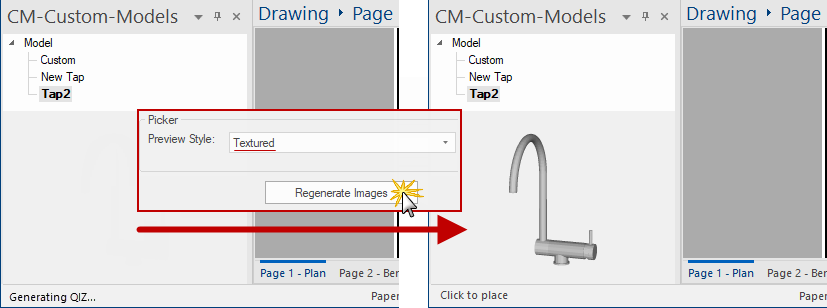
When you make changes to the palette or style, you will need to click on the Regenerate All Images (.qiz) button to apply these changes.

Use the  button when you need to generate only the missing images for your palette, especially when adding new cabinets to your catalog.
If the required cabinet/item is still not displaying in the gallery palette, check if they are enabled in the Palette Gallery - see Palette and Gallery Images note.

See also tutorial on how to Add Model's.